Process Analytics · B2B SaaS

When the dashboard isn't enough

Designing operational intelligence for a Gartner BOAT certification attempt — turning fragmented dashboards into actionable process analytics that answered the questions users actually had.

A certification requirement that revealed a deeper product gap

Pipefy was pursuing Gartner BOAT (Business Observability & Analytics Tools) certification — a strategic differentiator that would validate the platform's analytical capabilities against industry standards. Process Intelligence wasn't just a feature request; it was a certification requirement and a business imperative.

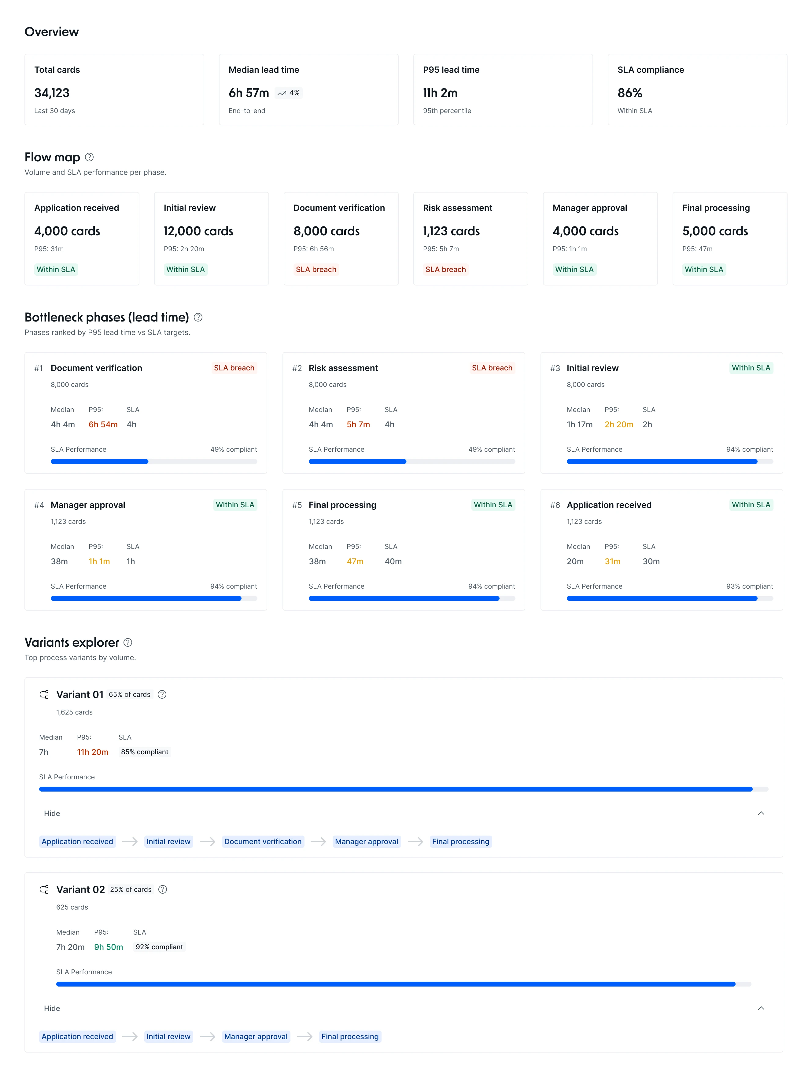
But when we talked to users, we found something more fundamental: existing dashboards were fragmented, static, and required heavy manual interpretation. Customers were exporting data to external analytics tools because Pipefy couldn't answer the questions they actually had:

01

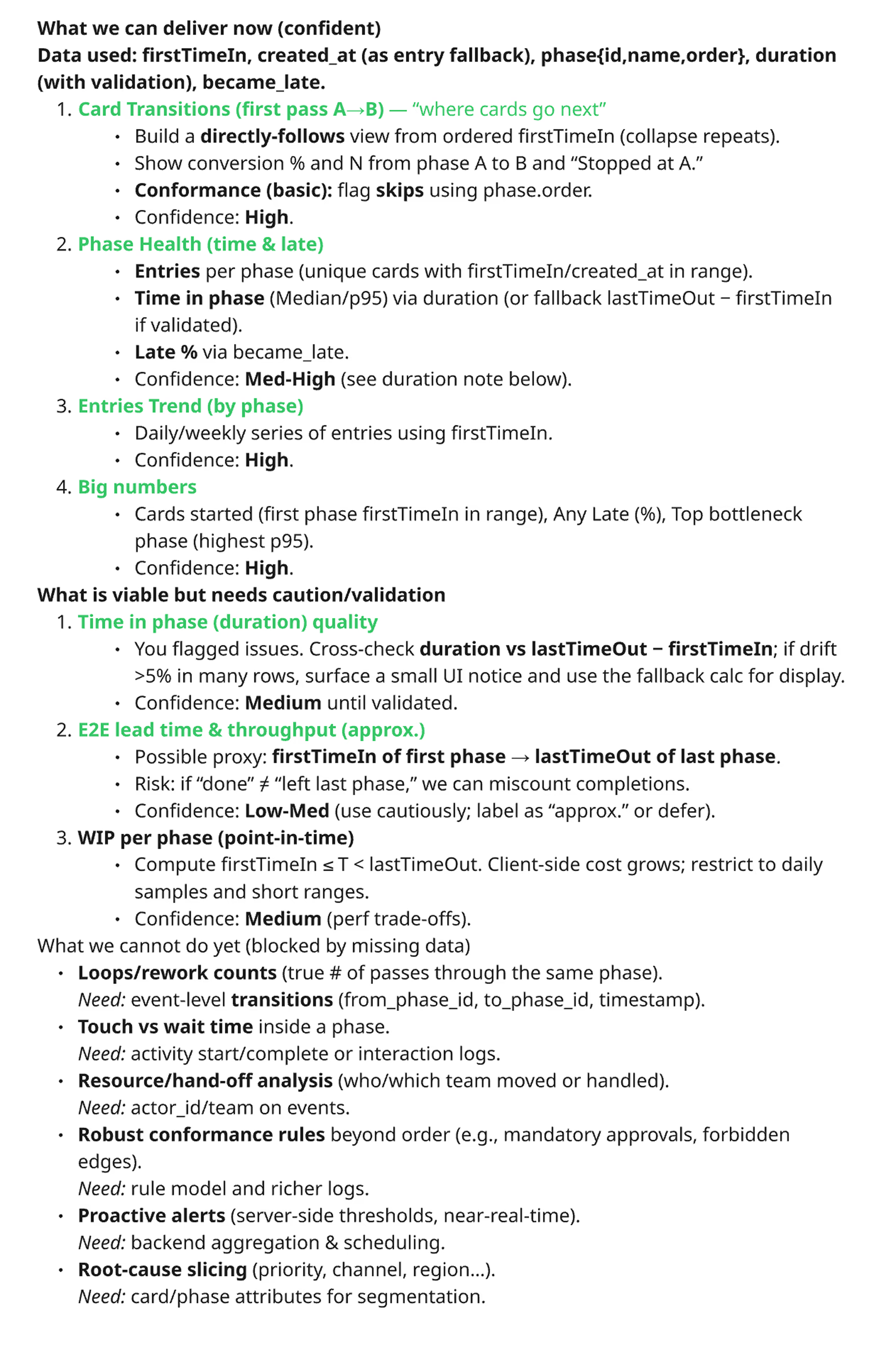
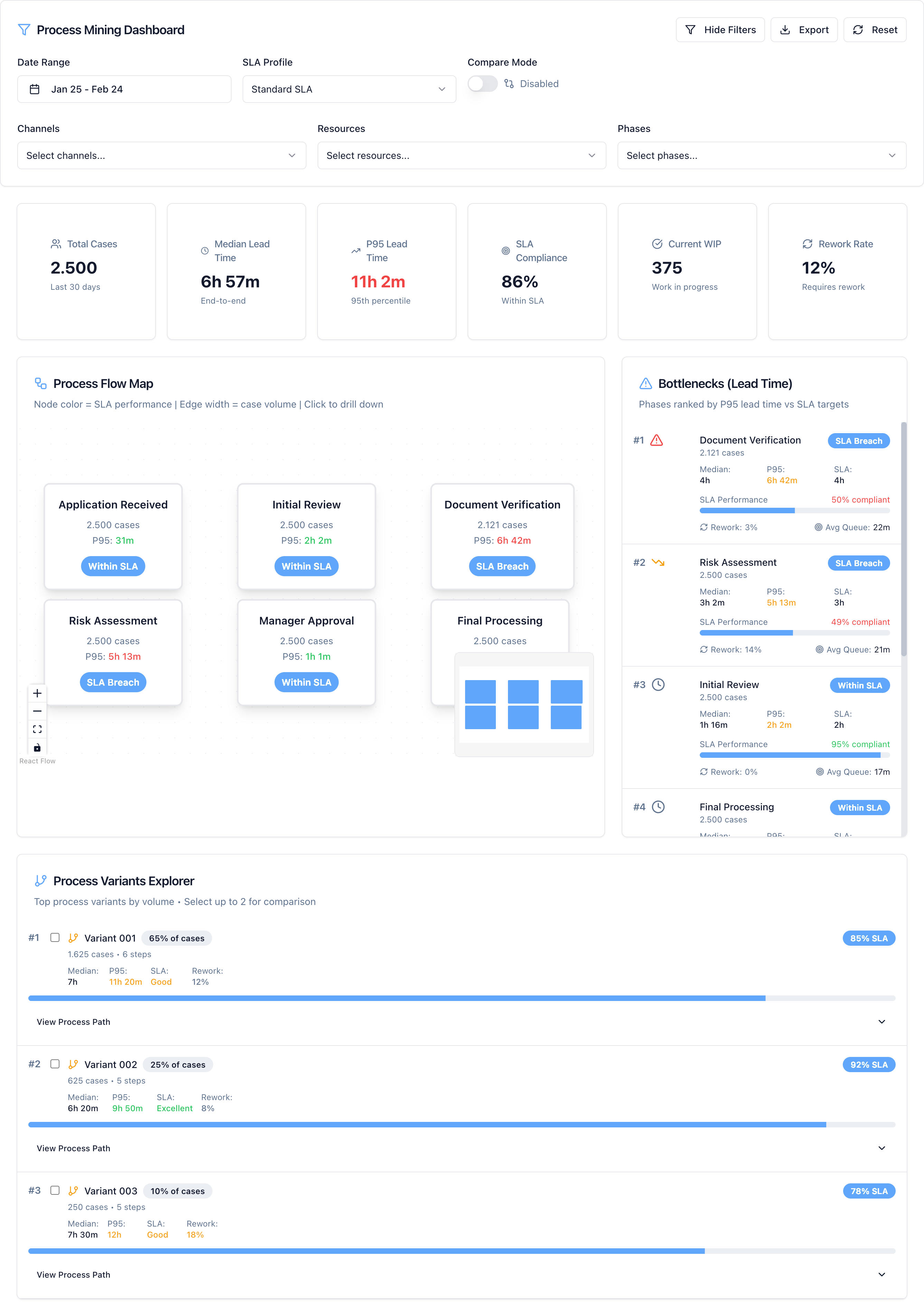
"Where are my bottlenecks?"

No clear view of where cards stalled or accumulated across phases.

02

"How does my process vary?"

No visibility into how processes actually behaved in the real world versus the designed flow.

03

"Which phases cause delays?"

Duration data existed but couldn't be linked to systemic patterns or process decisions.

04

"How do I prove ROI?"

No way to measure efficiency gains or justify automation investments with data.

Meet 12 certification criteria — without losing sight of actual users

The business challenge was dual: achieve Gartner BOAT certification while delivering genuine user value. These two targets are related but not identical. Certification criteria are defined by analysts; user needs are defined by operational reality. Getting both right required a deliberate translation layer between the two.

The real tension wasn't technical — it was between what Gartner required and what users actually needed. Solving for one without the other would have been a failure on both fronts.

The constraint added complexity: Engineering had no budget for new backend architecture in the MVP. That meant designing a meaningful analytics experience within the limits of existing data — and being honest about what those limits were.

Design lead and cross-functional translation layer

I was the design lead for Process Intelligence — responsible for strategy, execution, and cross-functional alignment. My most significant contribution was translating Gartner's 12 certification capabilities into a technically feasible and genuinely useful product strategy.

1

Strategy — Gartner translation

Ran direct sessions with Gartner analysts, conducted backend data audits with Engineering, and made explicit MVP scoping decisions. I owned the mapping from certification criteria to product capabilities — deciding what made it into V1 and what became a documented roadmap item.

2

Execution — IA, progressive disclosure, and interaction design

Owned the information architecture, progressive disclosure model, and visual system for complex metrics. Built interactive prototypes in Lovable and ran multiple usability validation cycles across different user profiles.

3

Cross-functional alignment

Acted as the translation layer between Gartner's evaluation criteria, Engineering's architectural constraints, and users' operational questions — co-creating technical specifications that mapped data availability to design decisions, with explicit confidence levels documented for each metric.

Boundary: not responsible for backend data modeling decisions — but understood constraints deeply enough to design within them, including documenting confidence levels for each metric alongside Engineering.

Four decisions that shaped the product

The most interesting design work on this project wasn't interface design — it was strategic. Four decisions determined whether the product would be trustworthy, useful, and buildable within the given constraints.

1

The MVP constraint as strategic advantage

Engineering couldn't introduce new backend architecture for MVP. Instead of treating this as a blocker, I reframed it as a forcing function for focus. We explicitly removed automation analytics and Gartner's "loop detection" capability from V1 — only first-phase entries were tracked, not re-entries. These became documented V1+ features. The constraint clarified what mattered most.

2

Designing for uncertainty — and saying so

Our data couldn't guarantee definitive conclusions. Rather than hiding that, I embraced and communicated approximation: "Possible bottlenecks" instead of "Bottlenecks," suggestion icons instead of alerts, explanatory tooltips on every metric, and documented confidence levels co-created with Engineering. Transparency built more trust than false precision would have.

3

Reconciling Gartner + Engineering + Users — the Phase Transition Trend

One of the hardest problems was finding a single solution that simultaneously satisfied Gartner's conformance requirement, was technically feasible with available data, and answered a real user question. The answer was the Phase Transition Trend: a matrix showing the most common paths cards took between phases. Users got "sticking points" insight, Gartner's conformance requirement was satisfied by flagging skips via phase.order, and it was buildable with firstTimeIn data.

4

Deep technical collaboration as a design input

I co-created technical specifications with Engineering that mapped data availability to design decisions — assigning explicit confidence levels (High / Med-High / Low-Med) for each metric. Data modeling became design work. Understanding what the backend could and couldn't guarantee shaped every interface decision, from labels and tooltips to empty states.

Technical specification co-created with Engineering — mapping available data to design decisions with explicit confidence levels per metric
The technical specification co-created with Engineering — what data we could confidently deliver, what needed caution, and what was out of scope for V1

Prototyping in Lovable From rough proof-of-concept to validated structure

I built interactive prototypes in Lovable to validate the information architecture and test progressive disclosure patterns before committing to final designs. Multiple iteration cycles across different user profiles — operations managers, finance leads, and process admins — allowed rapid refinement of metric clarity, hierarchy, and labeling conventions.

Early Lovable prototype — Phase Health table, Phase Transitions list, Basic Conformance indicator, and Entries Trend chart
First working prototype — Phase Health, Phase Transitions, and Basic Conformance, scoped to what data was available
Exploratory prototype — AI Agent Analytics dashboard showing agent coverage, efficiency by action, and response time distribution
Exploratory direction — AI Agent Analytics, later consolidated as the AI Coverage section
Iterated prototype — Process Mining Dashboard with SLA profiles, Process Flow Map, Bottlenecks, and Process Variants Explorer
Iterated prototype — SLA profiles, Process Flow Map, Bottlenecks, and Variants Explorer
First design iteration — Overview summary, Flow Map per phase with SLA indicators, Bottleneck Phases ranked by P95, and Variants Explorer
First design iteration — Flow Map with SLA per phase, Bottleneck Phases ranked by P95, and Variants Explorer showing process paths

Process Intelligence — the delivered product

The final product shipped inside Pipefy's native UI, covering four analytical layers: the Phase Transition Trend (the central bottleneck and conformance view), AI Coverage (agent adoption and impact per phase), Phase Health (performance metrics per phase with P95 and late-card indicators), and Team Workload (distribution across assignees). Each section was built to answer a specific user question — and stayed within the constraints of what the existing data model could reliably support.

Process Intelligence dashboard — Phase Transition Trend matrix, AI Coverage section with active agents and cards with agent actions, Phase Health table per phase, and Team Workload distribution
Process Intelligence — Phase Transition Trend, AI Coverage, Phase Health, and Team Workload shipped inside the Pipefy UI
Detail view — Phase Transition Trend showing card flow percentages between phases and AI Coverage section with active agents, phases covered, and cards with agent actions
Detail — Phase Transition Trend matrix and AI Coverage, the two core sections of the product

A foundation for certification — and for what comes next

Pipefy advanced toward Gartner BOAT certification. The first attempt didn't result in full certification — maturity gaps in loop detection, robust conformance, and proactive alerting were identified — but those gaps now directly inform the roadmap, and the groundwork for the next attempt is solid.

  • User value delivered — Clear bottleneck identification and visibility into real process behavior. Enterprise customers could answer fundamental operational questions directly in Pipefy for the first time, reducing dependency on external analytics tools.
  • Platform reference — Analytics patterns established in Process Intelligence are now used as a reference for other product areas, building a shared visual language for data presentation across Pipefy.
  • AI foundation — Operational intelligence is a prerequisite for useful AI recommendations. The data model and visualization patterns built here create the foundation for future Copilot capabilities.
  • Reusable components — The confidence-level system, the Phase Transition Trend matrix, and the progressive disclosure model are reusable across future analytics work — reducing design and engineering ramp-up time.

What I learned

Certification and user value are related but not the same target. Solving both requires keeping two separate criteria in view simultaneously — and being explicit when they pull in different directions.

Data modeling is design work. Understanding what the backend could and couldn't guarantee shaped every interface decision. The earlier a designer engages with data constraints, the better the resulting product.

Constraints clarify strategy. The no-new-architecture rule forced a more focused MVP than we might have built otherwise. What felt like a limitation became a discipline — and a better product.

Transparency builds trust. "Possible bottleneck" with an explanatory tooltip beat a definitive label we couldn't fully support. Users appreciated the honesty more than false confidence.

AI needs operational intelligence first. Before AI can make useful recommendations, users need to trust and understand the underlying data. This project built that foundation.